Time Series Scalar Plot
Time-series scalar plots are described here. Scalar data is defined as one-dimensional data where there is one measurement for every time stamp. This definition includes all scalar sensors, such as temperature, on both stationary and mobile platforms such as Wally (a crawler in Barkley Canyon) or the Vertical Profiling System (VPS). Multi-dimensional data from instruments like multibeam sonar, hydrophones, video cameras and other complex instruments are excluded. For 'Instruments by Location' and 'Variables by Location' data searches, data from multiple device deployments will be combined when they are compatible, so that users will see a single continuous record even though multiple devices/sensors contributed that data. Plots are available for all sensors on a device or variables by location search tree node or on a per sensor basis.
Oceans 3.0 API filter: dataProductCode=TSSP
Revision History
- 20150806: Device-level plots added to support state of environment data preview
- 20130725: Data product options implemented with more plot types, resample period, etc.
- 20120627: station search fully supported
- 20101130: 1 minute interval added to resampling options
- 20100513: Resampling option introduced
- 20091208: Data product initially released
Data Product Options
Quality Control
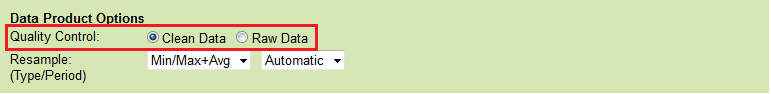
Raw Data
When this option is selected, raw data will be supplied in the data products: no action is taken to modify the data. In general, all scalar data is associated with a quality control flag. For plots, such as the time series scalar plot, data that fail quality control are marked on the plot with coloured data points and flag markers for emphasis.
Oceans 3.0 API filter: dpo_qualityControl=0
Clean Data
Selecting this option will cause any data values with quality control failures (QAQC flags 3, 4 and 6) to be replaced with NaNs. Because NaNs cannot be plotted, quality control failures will be excluded from any plots under the clean option. For all data products, when resampling with the clean option, any data with quality control failures are removed prior to the resampling (this rule applies to all resampling types: average, min/max, etc).
This is the default option for all data products.
Oceans 3.0 API filter: dpo_qualityControl=1
File-name mode field
'clean' is added to the file-name when the quality option is set to clean data.
Resampling
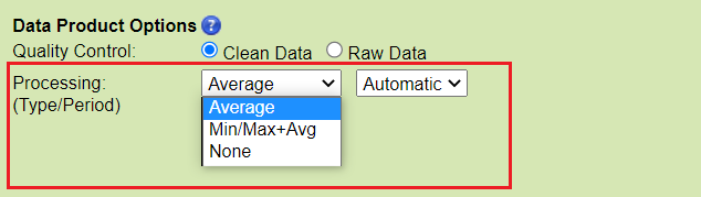
Resample Type:
None - no resampling.
Oceans 3.0 API filter: dpo_resample=none
Average - the mean value within resample period (fixed-window averaging without overlap). This is also known as a 'box-car' or ensemble average. It is subject to the 70% data completeness QAQC check (see below) with the exception of engineering data or data from irregular or scheduled sampling. Only available with the clean data product option.
Oceans 3.0 API filter: dpo_resample=average and dpo_average={0, 60, 600, 900, 3600, 86400}
Min/Max - the most extreme minimum and maximum values within resample period. It is subject to the 70% data completeness QAQC check (except for engineering data or data from irregular or scheduled sampling); QAQC flags are taken from the extreme data points.
Oceans 3.0 API filter: dpo_resample=minMax and dpo_minMax={0, 60, 600, 900, 3600, 86400}
Min/Max+Avg - the combination of the min/max and average as described above. The average is always calculated from clean data and will be NaN if there is less than 70% data available after cleaning. QAQC flags for min/max+avg with automatic resampling are the worst flag in the resample period, which includes the 70% check on data completeness (except for engineering data or data from irregular or scheduled sampling). This is the default option for time series scalar plots, other plots, such as the BHT, AGO, profile or staircase plots will have different options and defaults.
Oceans 3.0 API filter: dpo_resample=minMaxAvg and dpo_minMaxAvg={0, 60, 600, 900, 3600, 86400}
Resample Period:
Visible when an actionable resample type is selected, immediately to the right of the resample type. Current periods offered:
Automatic:
Oceans 3.0 API filter:
dpo_average=0
1 Minute:
Oceans 3.0 API filter:
dpo_average=6010 Minute:
Oceans 3.0 API filter:
dpo_average=60015 Minute:
Oceans 3.0 API filter:
dpo_average=9001 Hour:
Oceans 3.0 API filter:
dpo_average=36001 Day:
Oceans 3.0 API filter:
dpo_average=86400
When resampling is selected:
- The timestamps in the data series correspond to the centre of each resampling interval. (Data downloaded prior to 13 Feb 2013: timestamps were at beginning of interval). The resample interval always begins and ends at an integer multiple of the resample period, so minutes on the minute, hours on the hour, days on the day, etc.
- If the date/time range on the search has limits that are within a resampling interval, the date/time endpoints are extended to include the entire resampling interval. For example, when daily resampling is selected from 03:00:00.000 on Monday to 20:00:00.000 on Thursday, the date range is extended to 00:00:00.000 on Monday to 23:59.59.999 on Thursday.
- Note that tides are not filtered out in resampled products.
- No anti-alias filtering is done. This is why only averaging and min/max are offered at this time. Box-car / ensemble averaging is an easily understood and ubiquitous process that is effective as a low-pass anti-alias filter. For more information, see this page on data reduction and time-averaging.
- Spatial / mobile data may be resampled, but users are warned against this procedure, as it may be inappropriate to do so. Spatial averages or a geospatial display of the non-resampled data may be a better approach.
- All resampled data products are subject to an additional QAQC check on data completeness (except engineering data or data from irregular or scheduled sampling). If any resample period does not contain at least 70% of the expected data, the QAQC flag for this period will be a failure (6), unless overridden by a manual QAQC flag, see the QAQC page. For live data, it is quite likely that the last resample period will not be complete and will be flagged; this is especially obvious for plots. Future improvements will allow users to modify the data completeness threshold.
- Automatic resampling chooses the most appropriate resample period for min/max or min/max+avg resampling, such that the amount of data returned is adequate for plotting. For short duration plots, it can result in no resampling.
More options will be available in the future as we work to improve the data products. Feedback is welcomed and encouraged. For custom resampling, users can develop their own matlab code in the Oceans 3.0 Sandbox and run it in the ONC computing environment.
File-name mode field
The resample type and period are added to the file-name when resampling is selected. Examples: 'avg1hour', 'MinMax10minute', 'MinMaxAvgAuto15minute', 'MinMaxAvgAuto' (automatic resampling chose no resampling).
Plot Types
Plot types are determined by the resample type and whether the plot is device-level (multiple sensors) or sensor-level. Sensor-level plots provide more detailed data, options and metadata for individual sensors, while device-level plots provide an overview and comparisons between sensors.
Device-level Time Series Scalar Plots
Device-level or multi-sensor plots consist of multiple sub-plots, each with independent Y-axes and a common time axis. Each plot can have up to 5 sensors as sub-plots and if there are more than 5 sensors to plot, additional plots will be created, all with the same time axis (if the PDF format is selected, plots will be multiple pages within the same PDF file). Data is plotted as a simple line plot with alternating hues of blue colours to distinguish the sub-plots and Y-axes. Sensors are ordered alphabetically. Comments below the plot provide QAQC information. Here is an example (instruments by location search, one hour average):
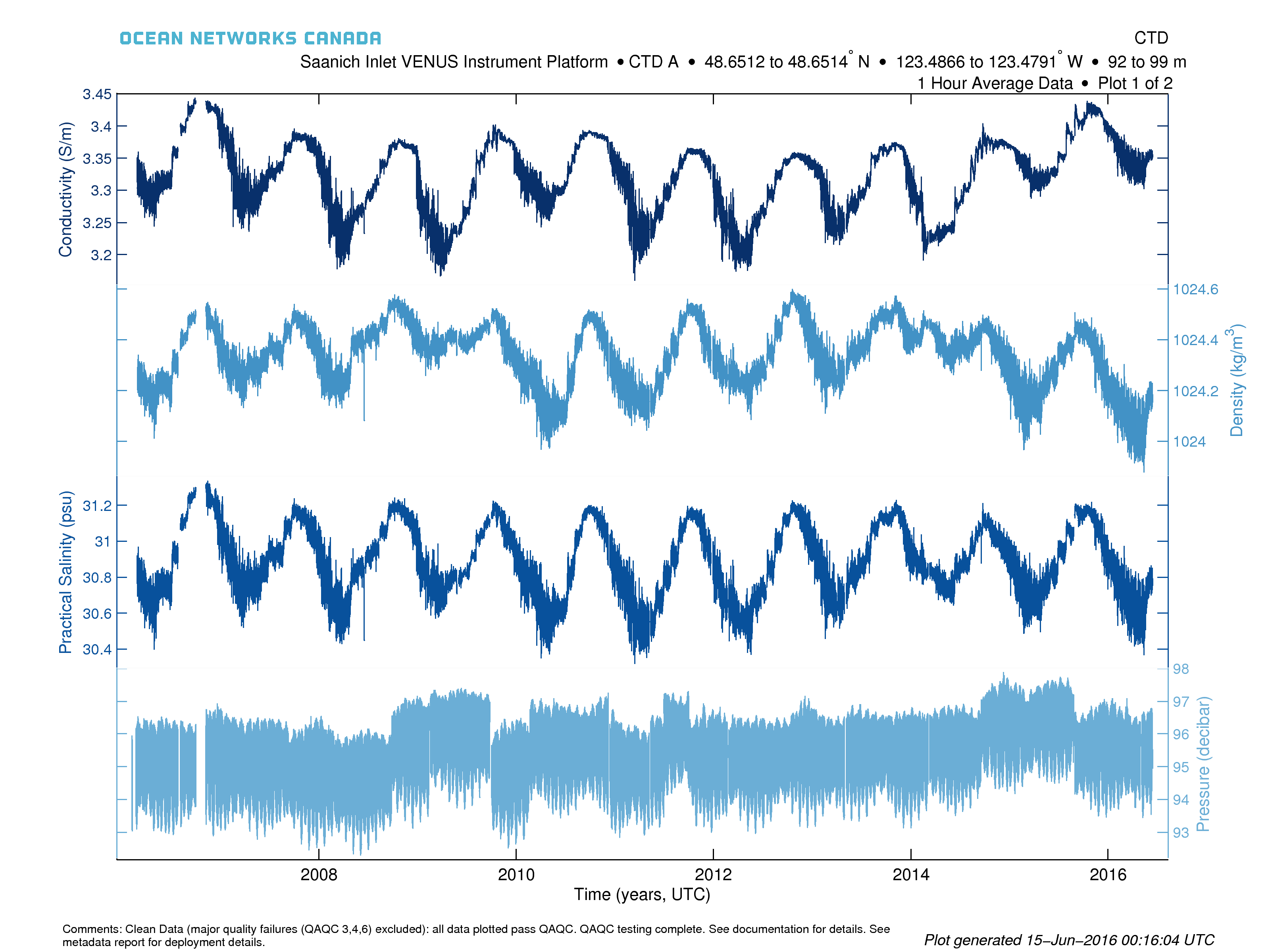
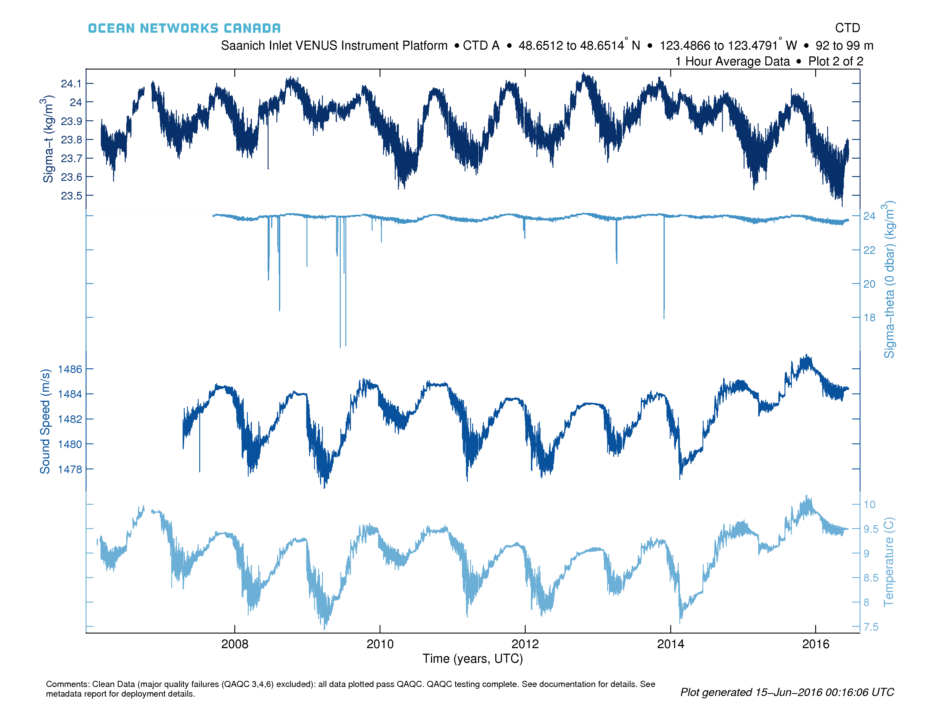
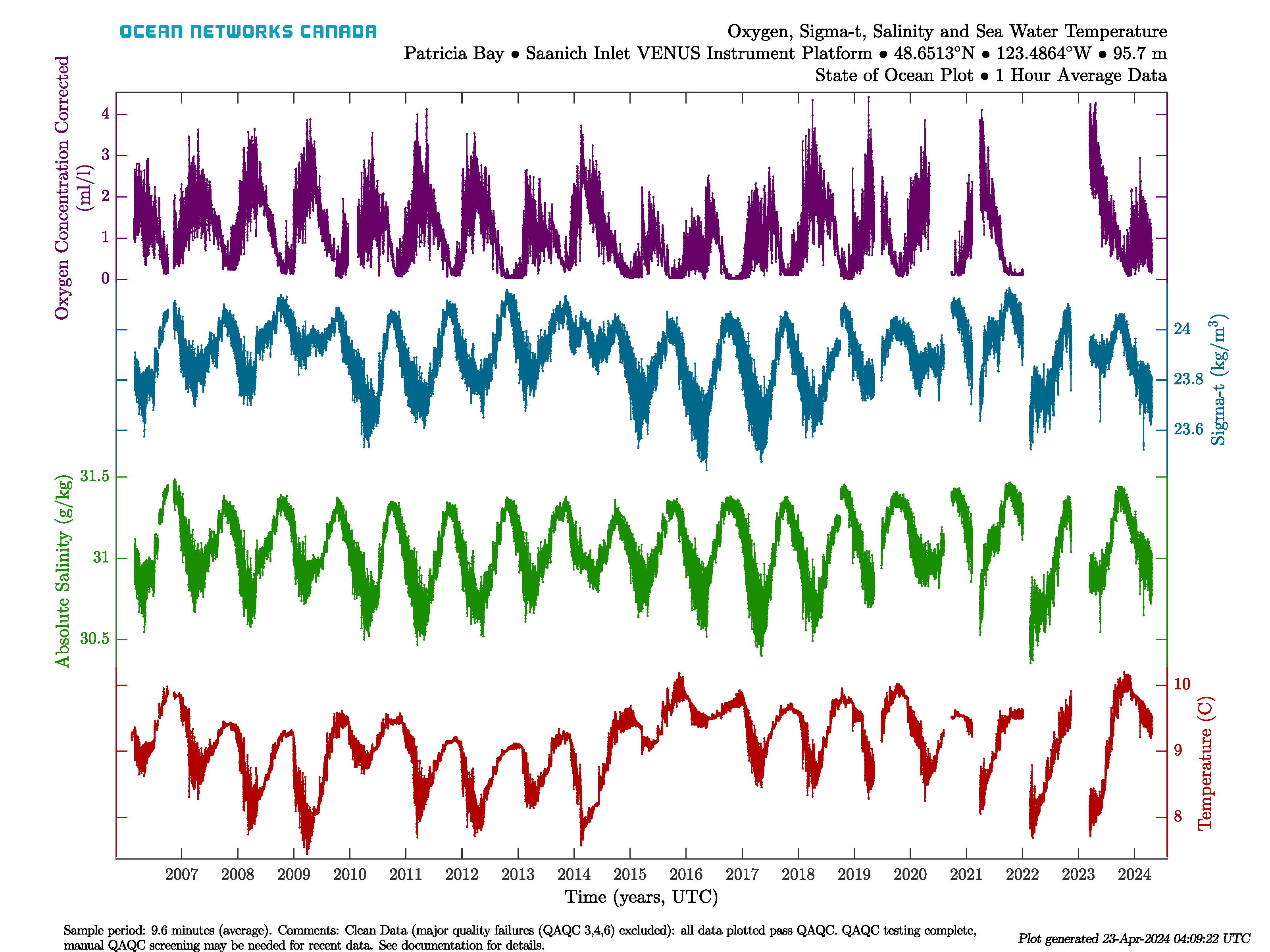
State of Ocean and Environment Plots
State of Ocean and Environment plots are designed to give a long-term overview of state variables for either the Ocean or Atmosphere. These plots appear on the website and on the Data Preview tool. They are equivalent to a 'Variables by Location' search with 'All Available' time range, 1 hour averaging for the four or five variables put together into one search request. These searches are run on a schedule, usually once per day. State of Ocean/Environment plots are essentially device-level time series scalar plots, but have a specific colour scheme, as follows:
Sensor Type | Colour | State of: | Sensor Type | Colour | State of: |
|---|---|---|---|---|---|
Sensor Type | Colour | State of: | Sensor Type | Colour | State of: |
| Sea Temperature | Red | Ocean | Air Temperature | Red | Atmosphere |
| Salinity | Green | Ocean | Barometric Pressure | Green | Atmosphere |
| Sigma-Theta (0 dbar) | Blue | Ocean | Solar Radiation | Blue | Atmosphere |
| Oxygen Concentration | Magenta | Ocean | % Humidity | Magenta | Atmosphere |
| Ice Draft | Orange | Ocean |
Here is an example State of Ocean plot for the Saanich Inlet VENUS Instrument Platform:
State of Ocean and Environment Climate and Anomaly Plots
These plots are based on the same information/configuration as the original State of Ocean/Environment plots, except that they use daily min/max + average data. These plots are available in Data Preview alongside the originals. Here are examples from Saanich Inlet:
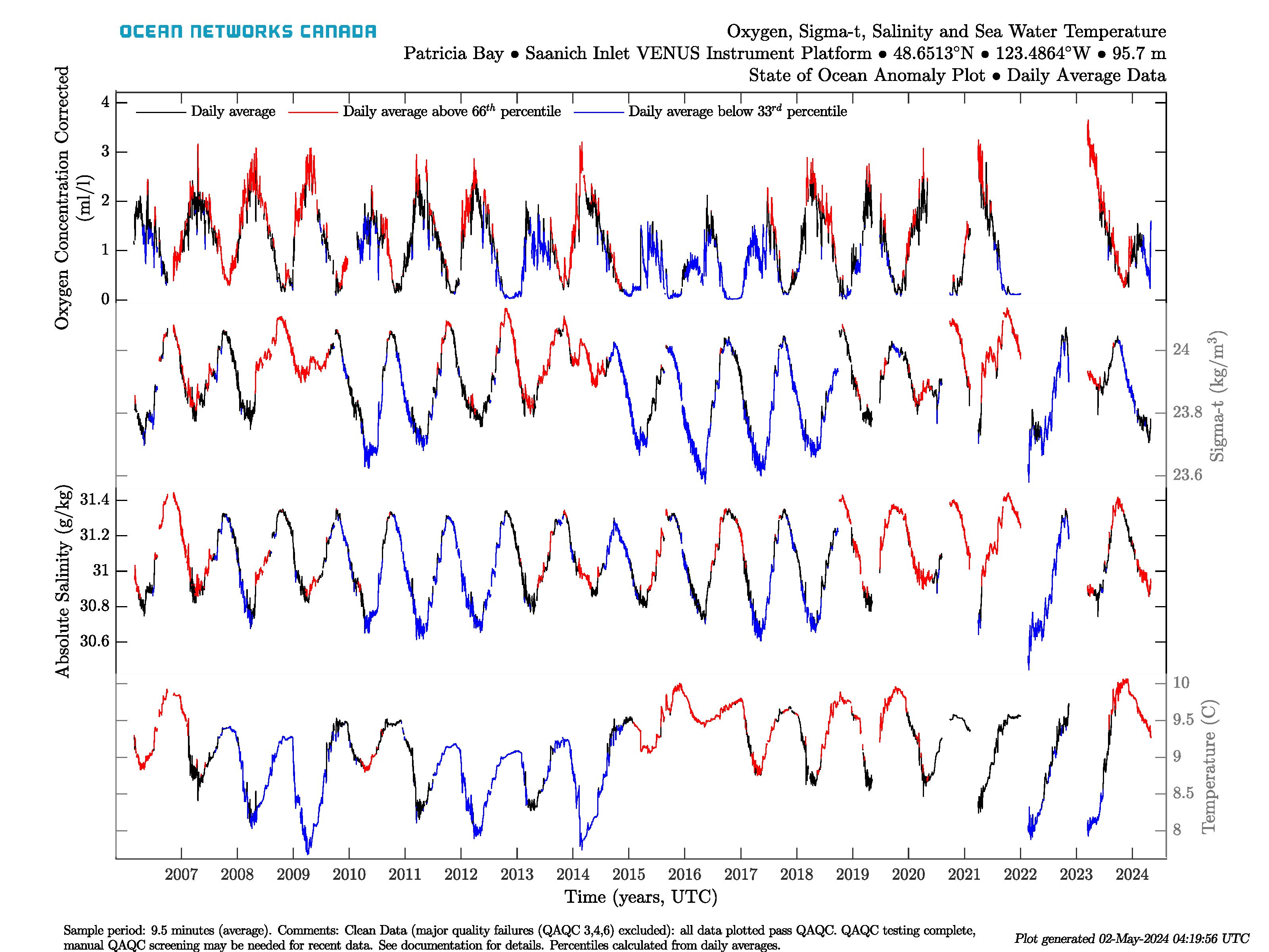
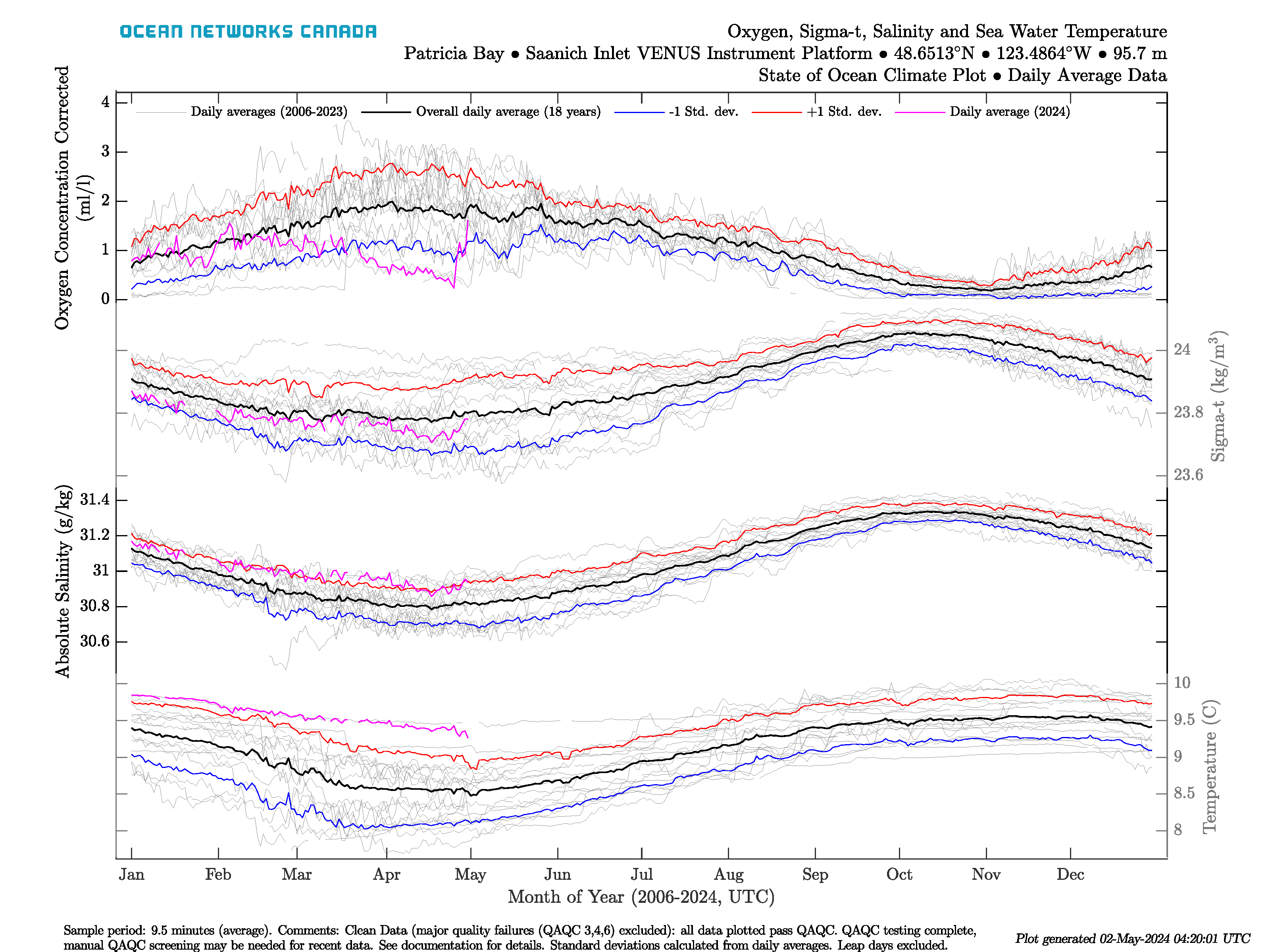
The anomaly plot (left) shows a time series of daily averages coloured on whether the value for that date is above the 66 percentile (red) or is below the 33 percentile (blue), where the percentiles are calculated from daily average values for that day of the year. The climatology plot (right) shows the day of year data for each sensor, showing the seasonality of the data. The grey lines in this plot are daily averages from every year, while the black lines are the overall day of year averages computed from the daily averages. The red and blue lines represent the day of year average plus and minus 1 standard deviation, respectively. Day of year standard deviation is also calculated from the daily averages from each day of the year. The magenta line is the current years' daily averages. Leap days are excluded from the climate plot and the day of year averages. The percentiles and standard deviations aren't showed if there is less than 3 years of data on each date, in that case, the anomaly plot will only show daily averages as black lines, the climate plot will omit the red and blue lines and comments will be added to the plots to indicate that this has occurred (it's common for new deployments).
State of Ocean and Environment Climate and Anomaly Data
The data behind these plots are available via links on their display in Data Preview. The file data products (CSV, MAT, ODV) are as documented in time series scalar data products, with the exception of the MAT file, which contains an additional structure called 'dataClimate'. 'dataClimate' is a copy of the 'data' structure, excluding non-climate sensors and replacing the min/max+avg values that exist in the 'data' structure with additional calculated values:

dailyTime, dailyAverage, dailyCount are copies of time, average, count in the normal 'data' structure, with data gaps filled. The code is capable of calculating these variables from hourly or other averaged data (currently we use daily data, so this step is essentially a pass-through). The dailyAverageByYear, dailyCountByYear are a reshape of the dailyAverage and dailyCount data into a matrix that is year by date, where the year is specified by iYear and the date is 1 to 365 (leap days excluded), so the matrix is n years by 365 days. dayOfYearAverage, dayOfYearCount, dayOfYearStdDev, dayOfYear33Percentile, dayOfYear66Percentile are the day of year statistics for each of the 365 years of the year, calculated using the dailyAverageByYear data only, without weighting by dailyCount or recalculation from the raw data. This average of an average approach is normal metrological procedure, as many metrological data sets only report daily min/max average values. The dayOfYearCount is the count of the raw readings on that day of the year, whereas dayOfYearCountDays is the number of days that have data. So for the 15 years of Saanich Inlet, if only 5 years have data on a specific day, that dayOfYearCountDays value is 5, but dayOfYearCount will be ~400000 readings. dayOfYearCountDays is used to determine if there is enough data (minimum 3) for a valid percentile calculation. dailyAverageAbove66Percentile, dailyAverageBelow33Percentile are the values used the anomaly plot, so that they are daily time series of the same size as the daily average data, and their values are either the dailyAverage or NaN if they are not above/below the percentile. The anomaly plot is then simply:
hold on;
plot(dailyTime, dailyAverage)
plot(dailyTime, dailyAverageAbove66Percentile, 'r')
plot(dailyTime, dailyAverageBelow33Percentile, 'b')
so that the red/blue colouring goes over top of the black daily average.
One more addition to the State of Ocean / Environment file products is a special "externally-derived" sensor. The MAT, CSV and ODV file have a "levelled-pressure" sensor in addition to the regular scalar pressure sensor. This purpose of this version of the pressure is to remove the variation between deployments so that a continuous time series is available. The algorithm to derive it is as follows: for each deployment remove the mean from the time series (i.e. zero mean), then concatenate the time series back together and add a fixed offset, calculated from the site depth (from the metadata) converted to pressure using the GSW toolbox. The effect is that the jumps in value at each deployment are removed and the time series is much more suitable for calculating tides, storm surge, etc. Users can do this calculation themselves with the deployment data that exists in the headers of the ODV and CSV files or the metadata structure in the MAT file.
Sensor-level Time Series Scalar Plots
Sensor-level plots have more room to show more detail, so there are more options and features available. For instance, all sensor-level plots annotate the extent of each device deployment in a legend, in addition to deployment start and stop markers.
The default sensor-level plot is the Min/Max + Average with Automatic resampling. This is the same default approach that Plotting Utility uses.
No Resampling and Resampling by Averaging
The no resampling or averaged data sets are generally plotted with a line graph, although there some complications to handle large and small data sets, particularly of this being a generally, operational product for an expansive, diverse range of data. The single point graphs consist of a line plot with markers (small data sets), line plot (medium to large data sets), or a heat map (complex large data sets).
Line Plot with Markers (Small Data Sets Less Than 1800 Points):
This type is known colloquially as 'knots on a rope'. The markers used are dots that decrease in size as the data set get larger. The markers indicate the exact time and data value of each data point. Users will see all the details of the data. The markers / dots disappear completely at 1800 data points. For less three data points or less, the line is not drawn.
Line Plot (Data Sets Greater Than 1800 Points) :
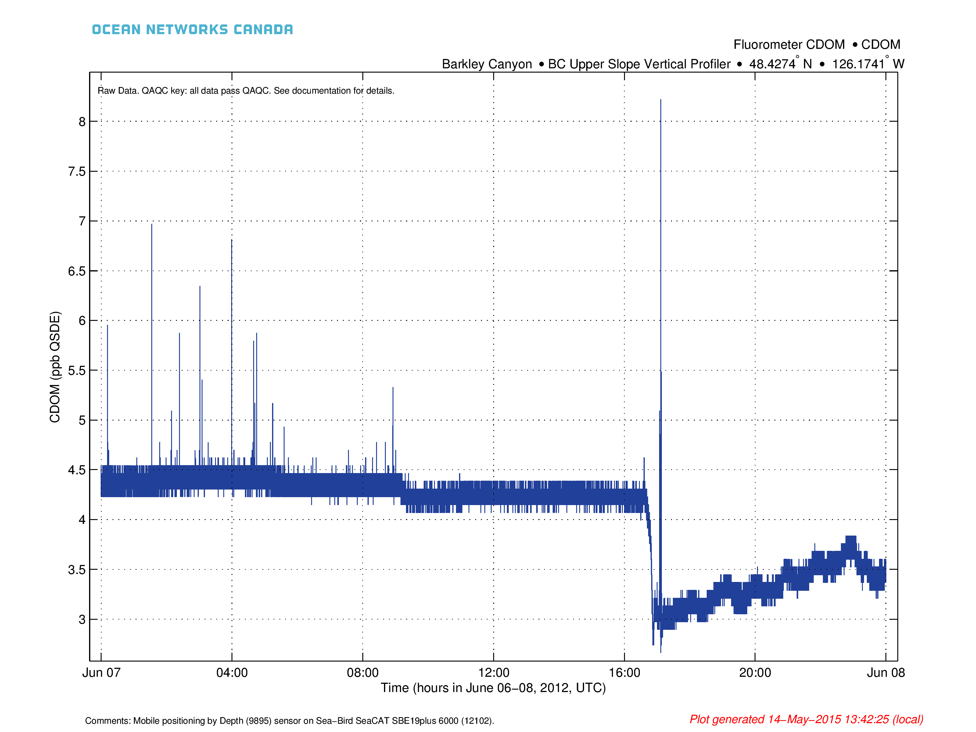
Line plots are used to illustrate trends in the data and guide viewer's eyes through the data points sequentially, usually assuming an even spacing of the data and no overlap or crossing of the lines. Lines are broken to avoid interpolating through data gaps. Data gaps are defined as 1.9 times the sample period. This value was chosen for some allowance for jitter in the time stamps of the data. For small data sets, this is also why markers are used, to show the exact timing of the data points. When the data set grows too large, it becomes difficult for the software to handle (memory requirements), and more importantly, if the data is highly variable, the lines drawn will overlap, obscuring trends in the data. An example of overlapping data would be attempting to plot tide data for several years; all one will see is a big blue blob with no indication of the distribution of the data, just its gross extents. One method to visualize large data sets is the Min/Max+Average plot as discussed below (the default plotting option), another is the heat map, which is only available for the no or averaging only resample options where there is significant overlap (10% as calculated based on the thinnest line that can be resolved and the position of the data in the plot).
The examples below show data with gaps (left) and show an example where variation the data is obscured by line overlap (right) (this plot is not generated operationally but only as an example).

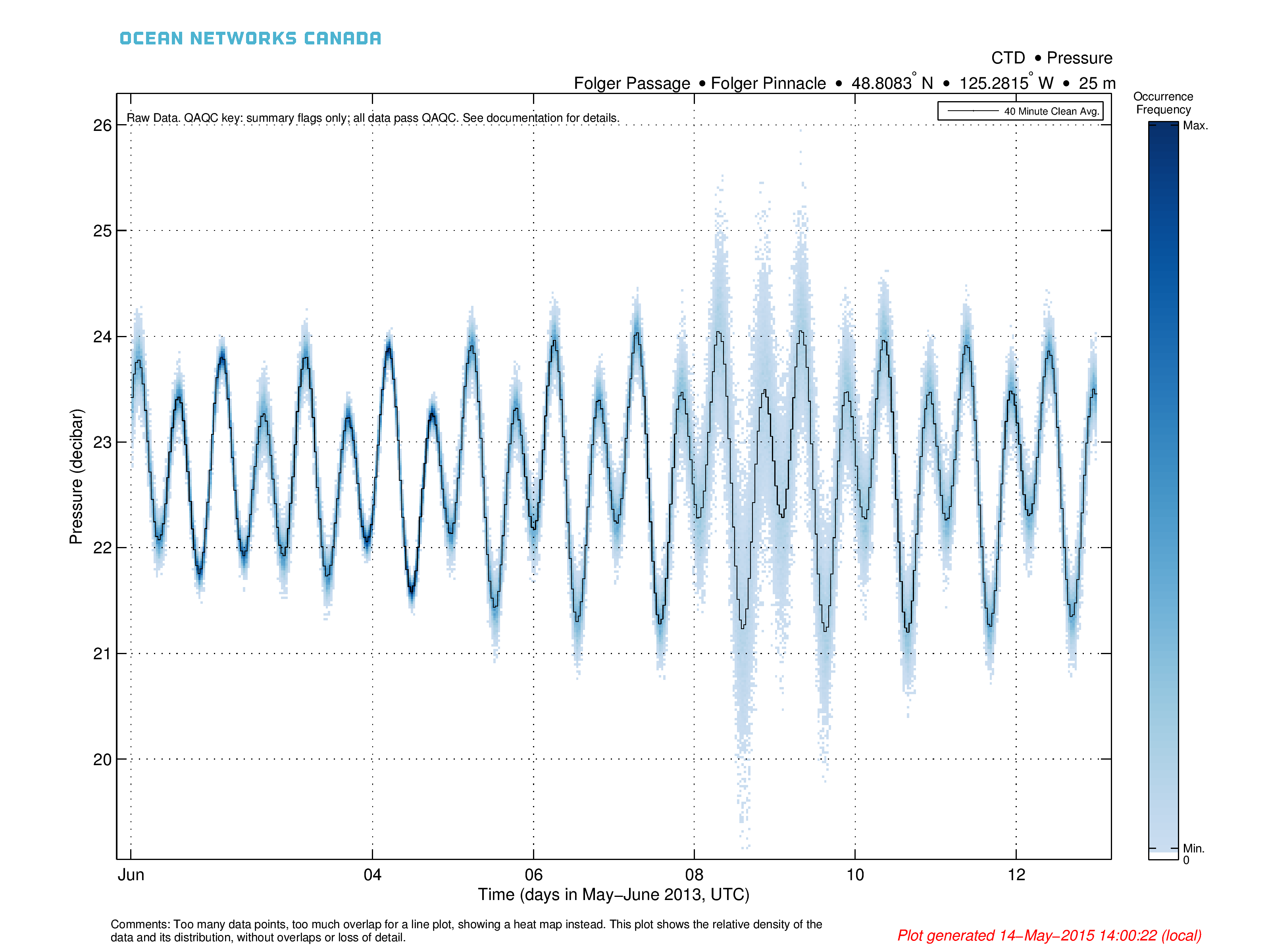
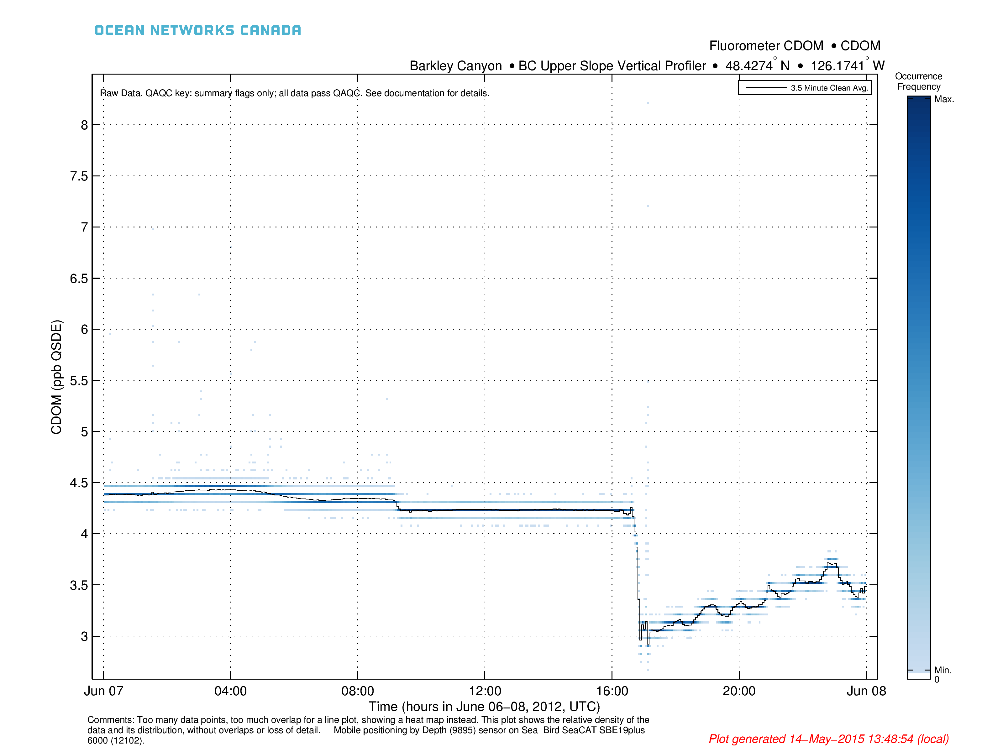
Heat Map (Data Sets Greater Than 14400 Points, Minimum 10% Line Overlap):
A heat map is like a scatter plot except that the user can discern the relative number of markers at a location where they are overlapping. Therefore, it resolves the overlap issue in line and scatter plots of large data. Users are able to see the distribution and trends within very large time series data sets. For advanced users, the core matlab commands that produces a heat map from ONC mat files is simply: z = hist3(data.time, data.dat); imagesc(z);. A heat map is a 3-D histogram, represented as an image, coloured by the number of data points that fall in each time by value bin. Colours range from white (no data), to light blue (least amount of data), to dark blue (greatest amount of data). Bins are sized to have at least 400 along the x axis, 300 along the y axis, so as to offer as high a resolution as a scatter plot. The actual number of data points in each bin is not shown as it is not comparable from plot to plot, due to the variable sizing of the bins. The relative number in each bin is shown, this is called the occurrence frequency.
A clean average line plot is overlaid on top of the heat map to illustrate the trend in the data. It is the same data as would be generated by the average resample option, with a period determined dynamically.
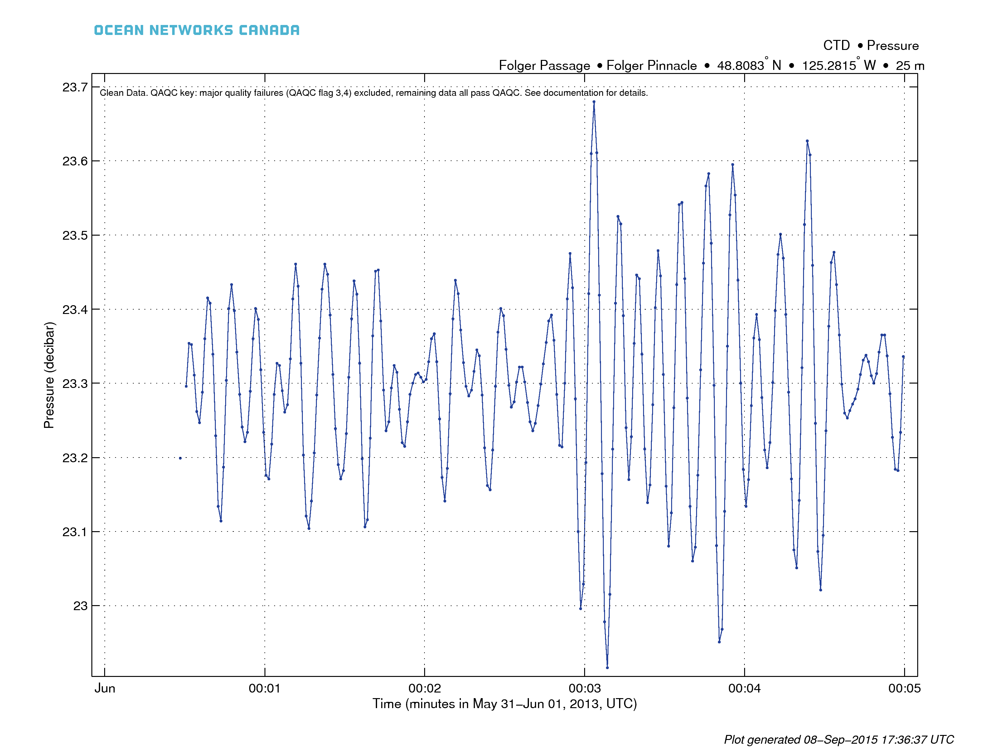
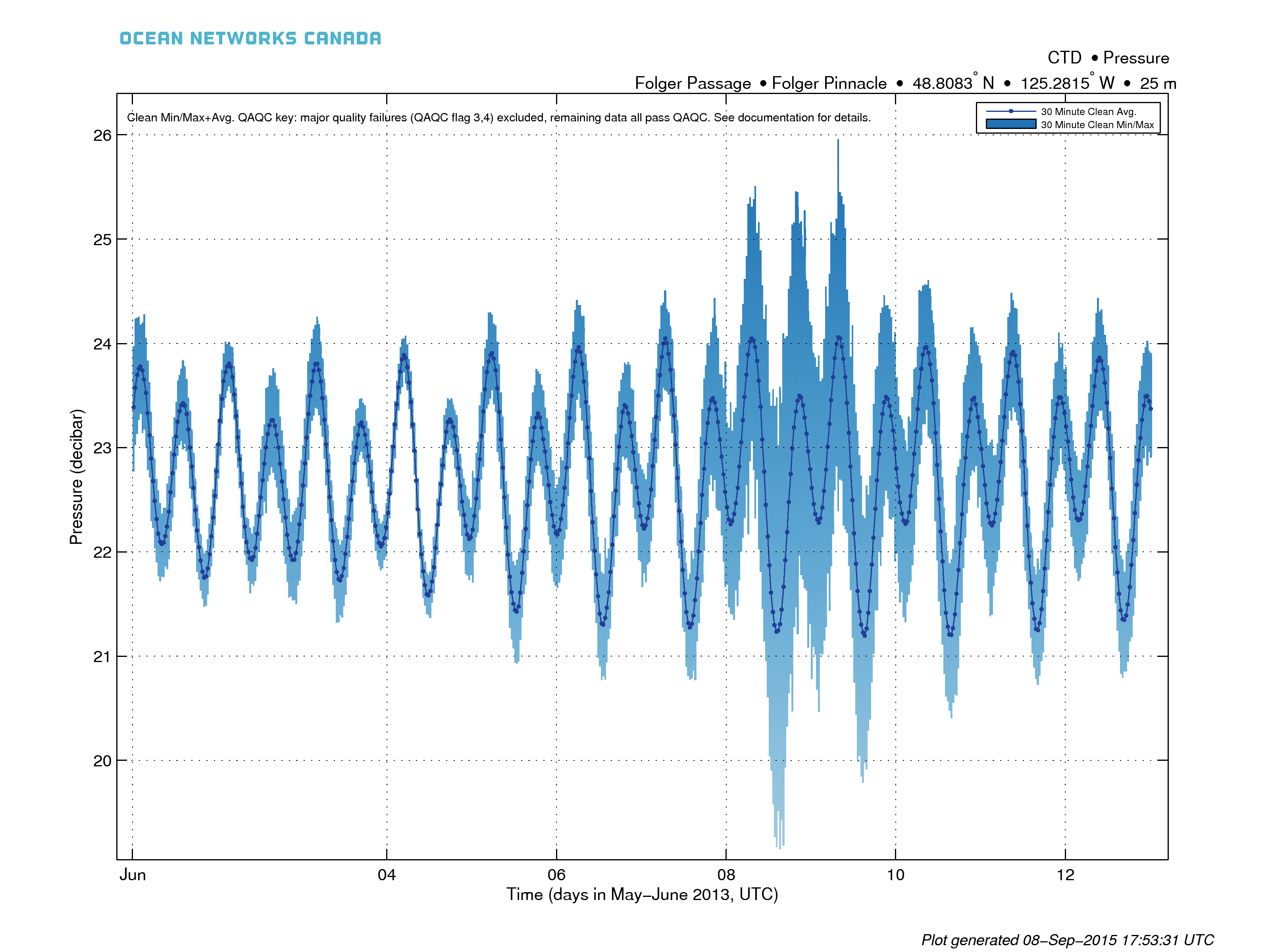
The example below on the left is of Folger Pinnacle CTD pressure data, one can see the tidal cycle, plus the variation of the pressure distribution due to the sea state, clearly showing the presence of a moderate-sized west swell running between the 8th and 10th of June, 2013. The example plot below on the right shows how the overlaid average is useful for seeing the trend in the data, while the heat map shows the distribution of the data. This example shows how the data is quantized due to the precision of the CDOM Fluorometer. A standard line plot would obscure details on the arrival of the ocean swell in the CTD pressure data, and it obscure or confuse the quantization of the CDOM data. In the latter case, a line plot would jump between CDOM values creating a big blue blog of data with little detail (compare to the same data shown as a line plot above).
The criteria for switching from a line plot to a heat map is based on when significant overlap will occur in the line plot. As a rule, overlap doesn't occur for small data sets (~14400 as determined by trial and error for the thickness of the line to be plotted and the number of pixels in the image). Overlap in line plots can be quantified, so heat maps will only be produced for overlap greater than 10%. Overlap becomes increasingly likely with more data, but is strongly dependent on the distribution of the data (scattered vs. monotonic contiguous). As the data set grows beyond a million data points, heat maps also become faster to plot and render than line plots. Due to memory requirements, all plots are capped at 26 million data points (the data set is broken into multiple plots by time).
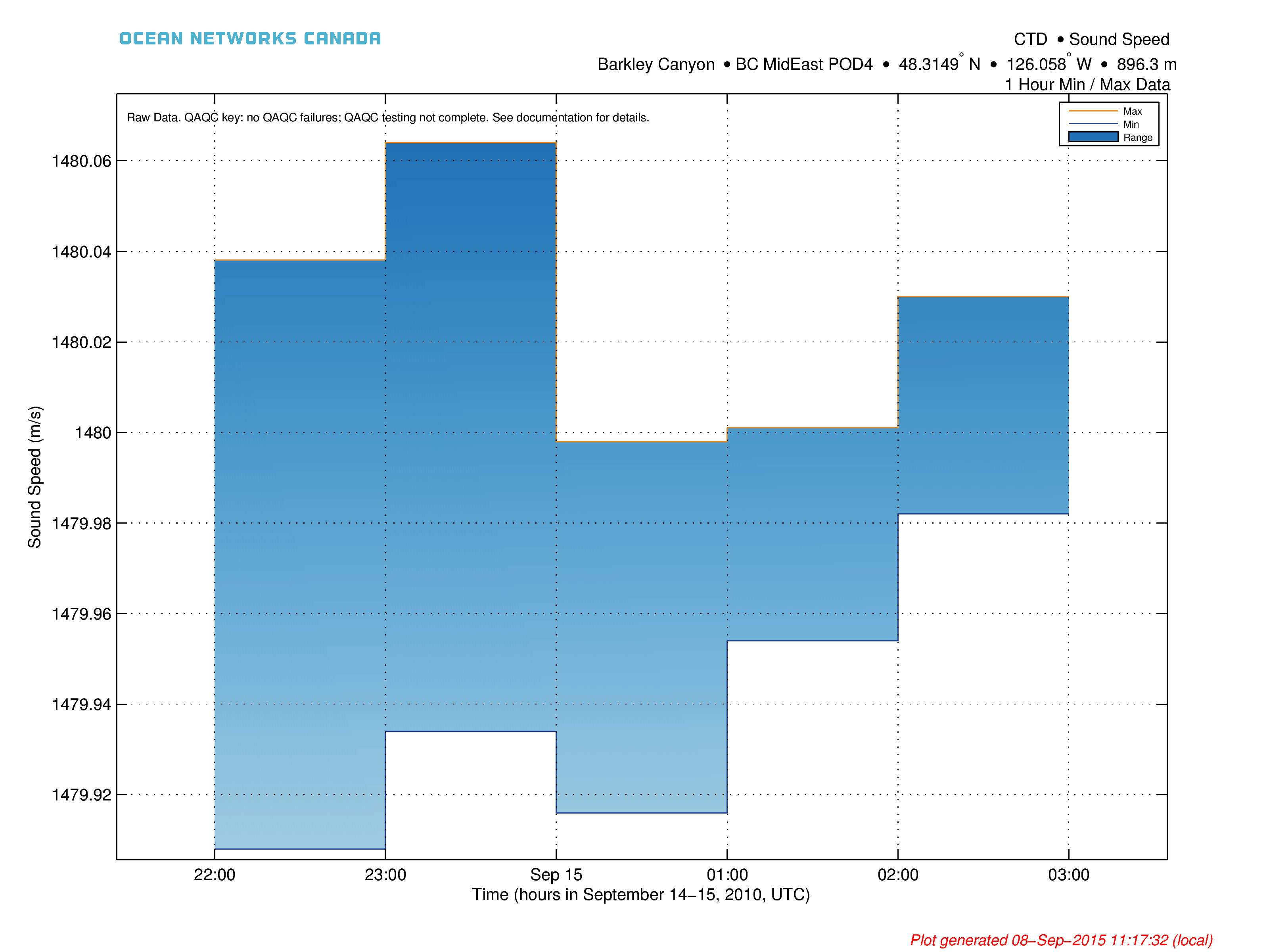
Min/Max Resampling
The min/max plots consist of two lines, one for each of the maximum and minimum data series, with a fill in between, as seen below. The lines are staircase or step-function plots, so when filling in the space, the plot is effectively a bar plot, with QAQC flags plotted on the raw data and the usual markers for the device deployments (not shown in the case below).
Min/Max+Avg Resampling
This is the default plot option, with an automatic dynamically determined resample period.
This plot type is the above min/max plot overlaid with a clean average (the same data that is generated with the average resample option). The default selection for the resample period is automatic, where resample period applied determined by the number of data to plot so that the plot is an adequate data summary plot. Users may also select a fixed resample period.
QAQC flags for fixed rate resampling are the flag values for the min and max data points, while the average flag is always a pass (QAQC flag 7, see the QAQC page), unless it fails the data completeness check. With automatic/variable resample periods, the flag presented is the worst flag within the resample period, including the data completeness check. For live data, the last resample period in the plot is often not yet complete. Therefore, the QAQC check on data completeness will often flag resampled live data with QAQC flag 6 (orange flags/markers), which indicates that the resampled data point does not have enough data to compute a good average/min/max, etc.
Min/max+average resampled plots have the advantage of clearly showing both the extent and trend in the data, without the overlap that occurs in line and scatter plots. This is the default type of plot in several ONC applications, including plotting utility (data search and plotting utility plots should be very similar despite the different platforms that generate them).
Here is an example min/max+average plot with automatic resampling for all available data. In this case, device deployments are indicated by the varying colours for the clean average:
Formats
Plots are available in PNG and PDF format. Basic metadata information is included in the titles. Note that the logo in the PDF product may appear 'fuzzy' in some viewers, see the PDF page for more details. See the mobile device page to see how these data products handle data from mobile devices.
Oceans 3.0 API filter: extension={png,pdf}
PDF Example:
Discussion
To comment on this product, log in and click Write a comment... below.